Back


My role
UX Designer — User Research, Interaction Design, User Flows, Usability Study, Visual Design, Prototyping
Timeline
November — December 2023
Project type
Self-initiated
Overview
Antiplagiat is the most popular web app among students in Russia to check texts for plagiarism.
Despite being intended to help students, it had many usability issues such as cluttered interface, confusing navigation, and unclear check results.
To address these problems, I redesigned the app's user flows with a focus on intuitiveness and student needs.
The result was a 64% improvement in the System Usability Scale. Usability study participants felt more confident and clear when completing plagiarism checks.
Highlights
Before
After
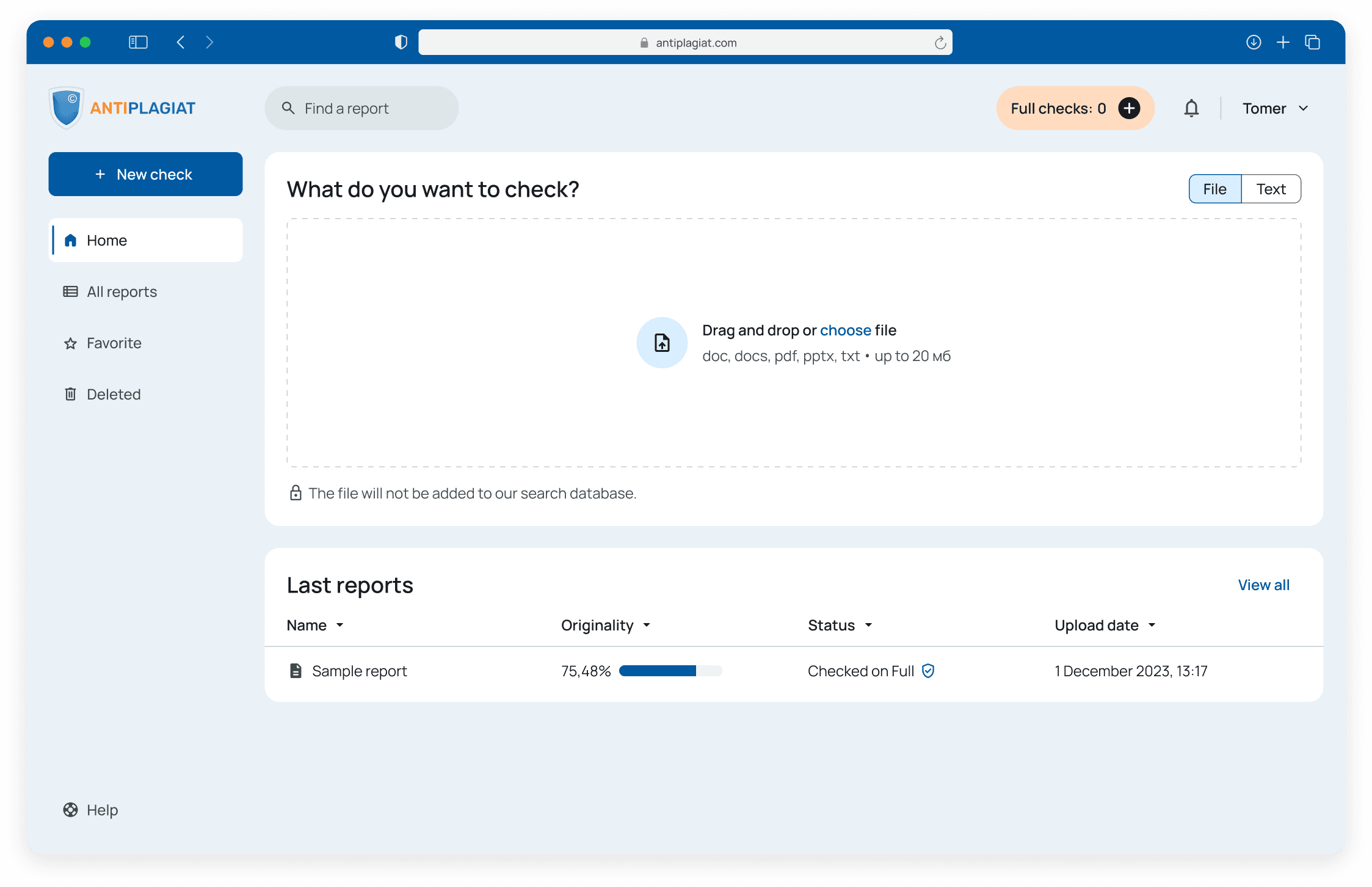
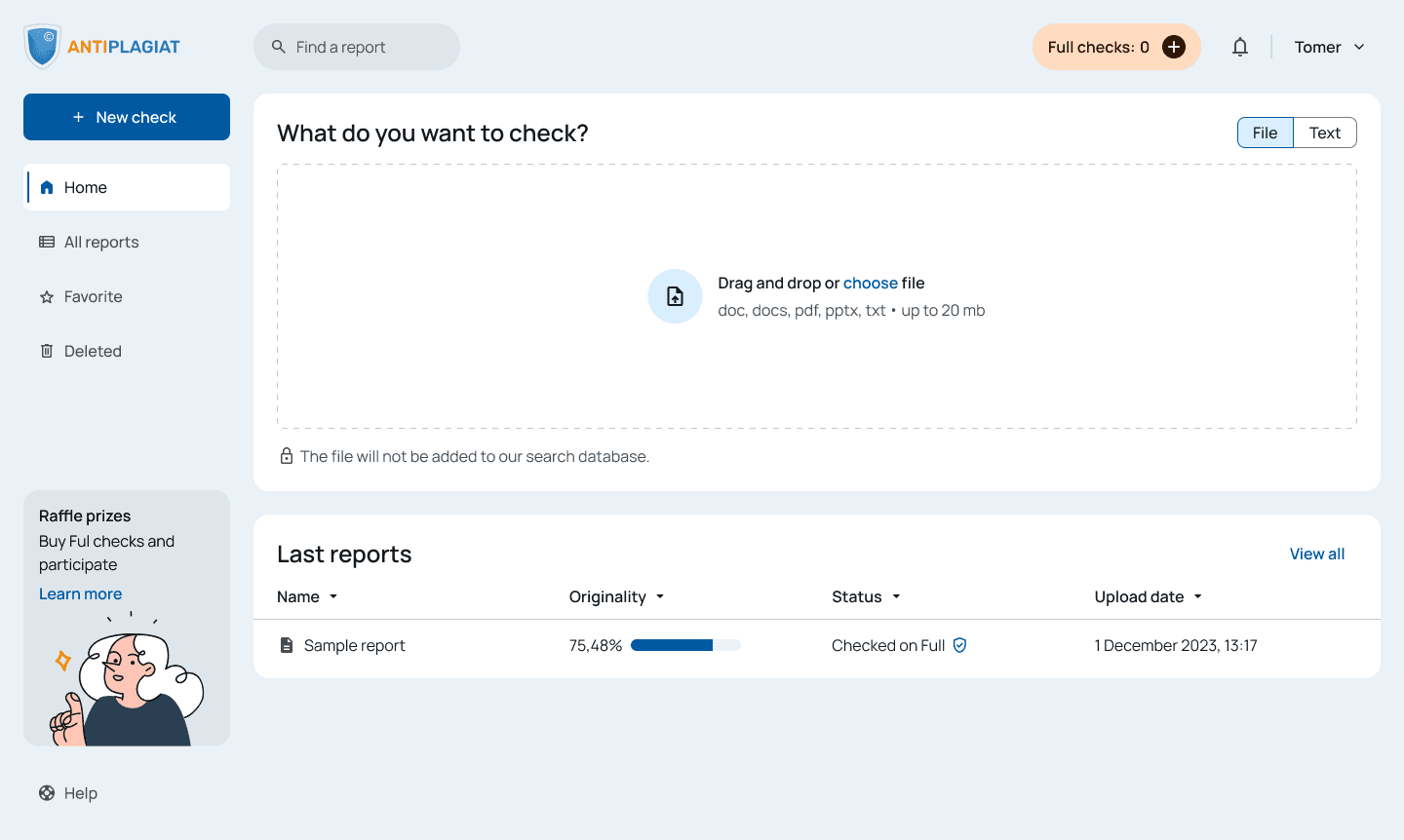
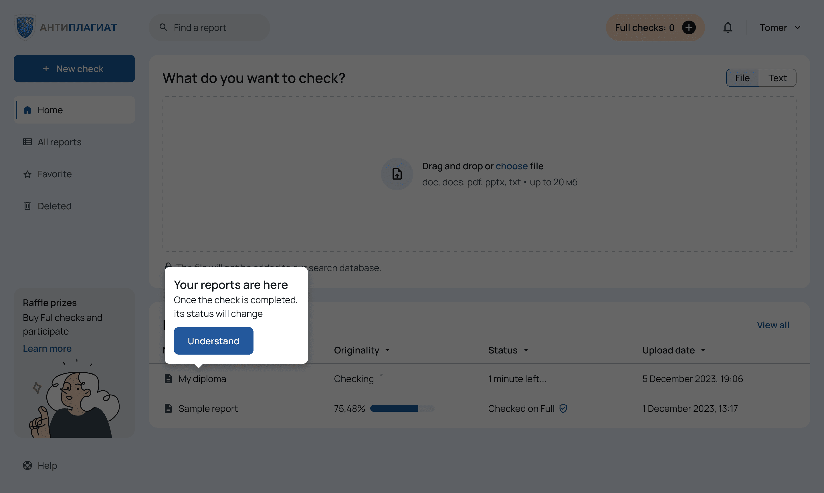
1.1 Homepage
Before
After
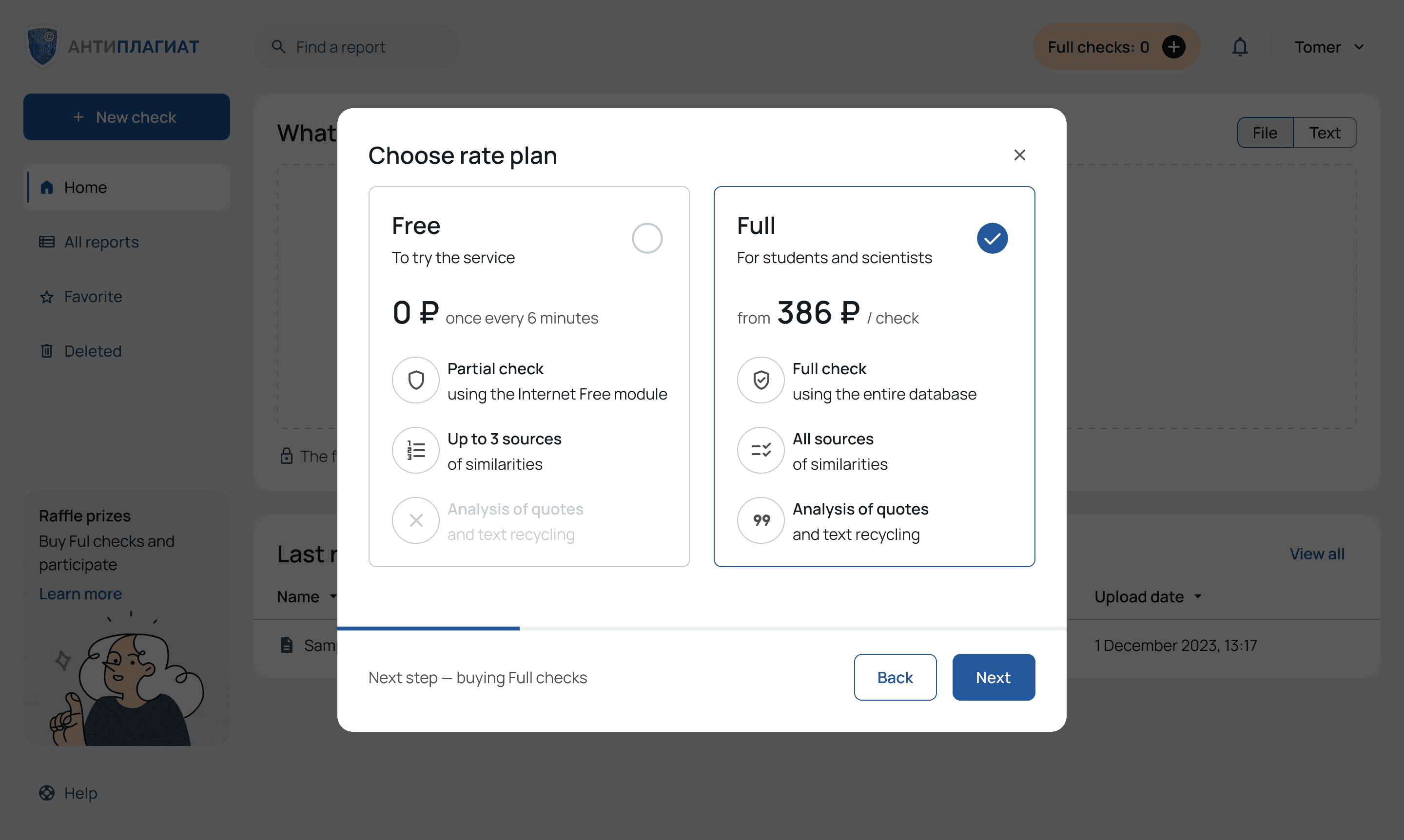
1.2 Choosing a rate plan
Before
After
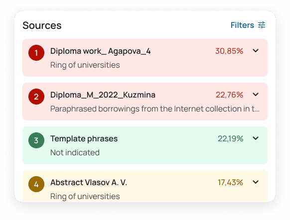
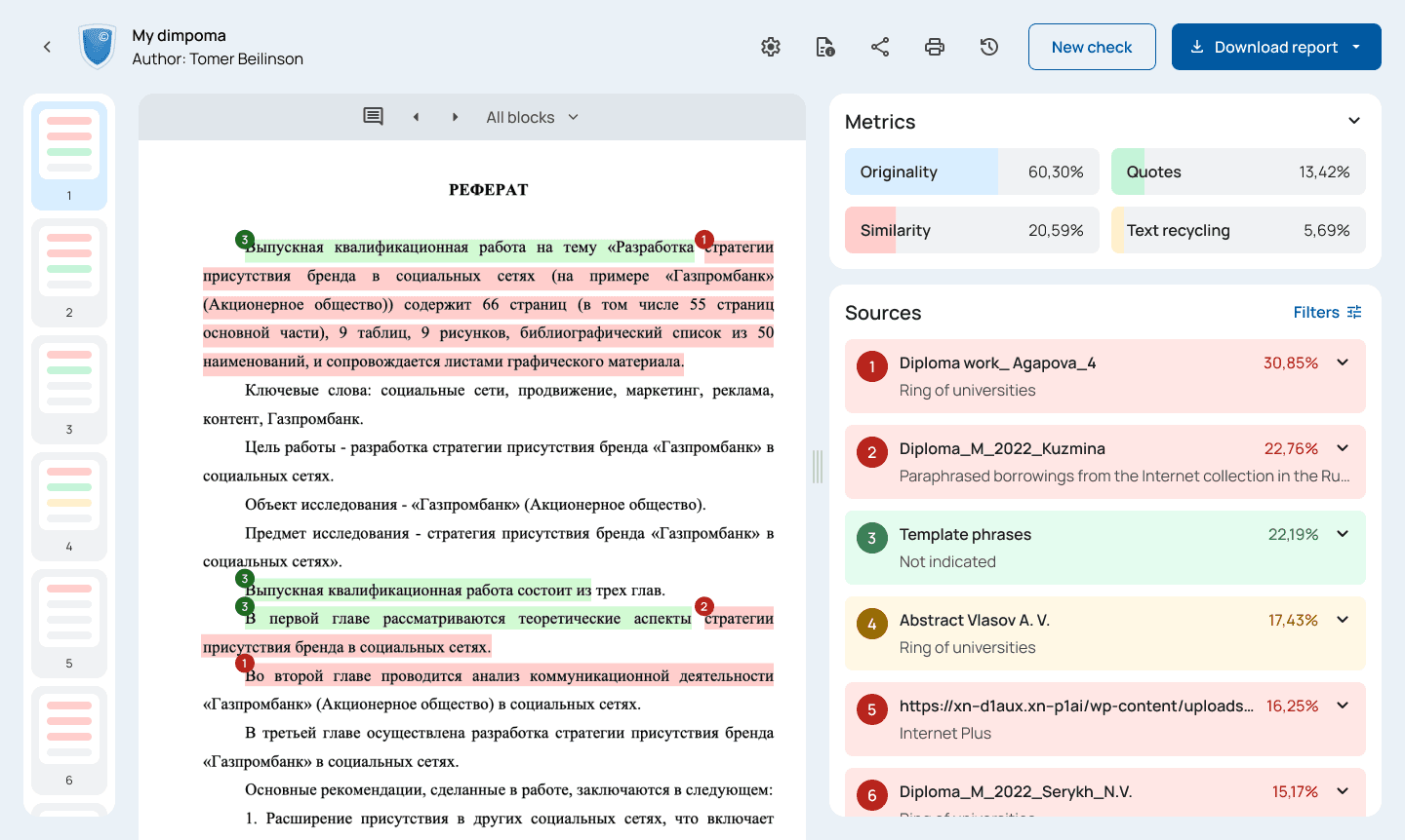
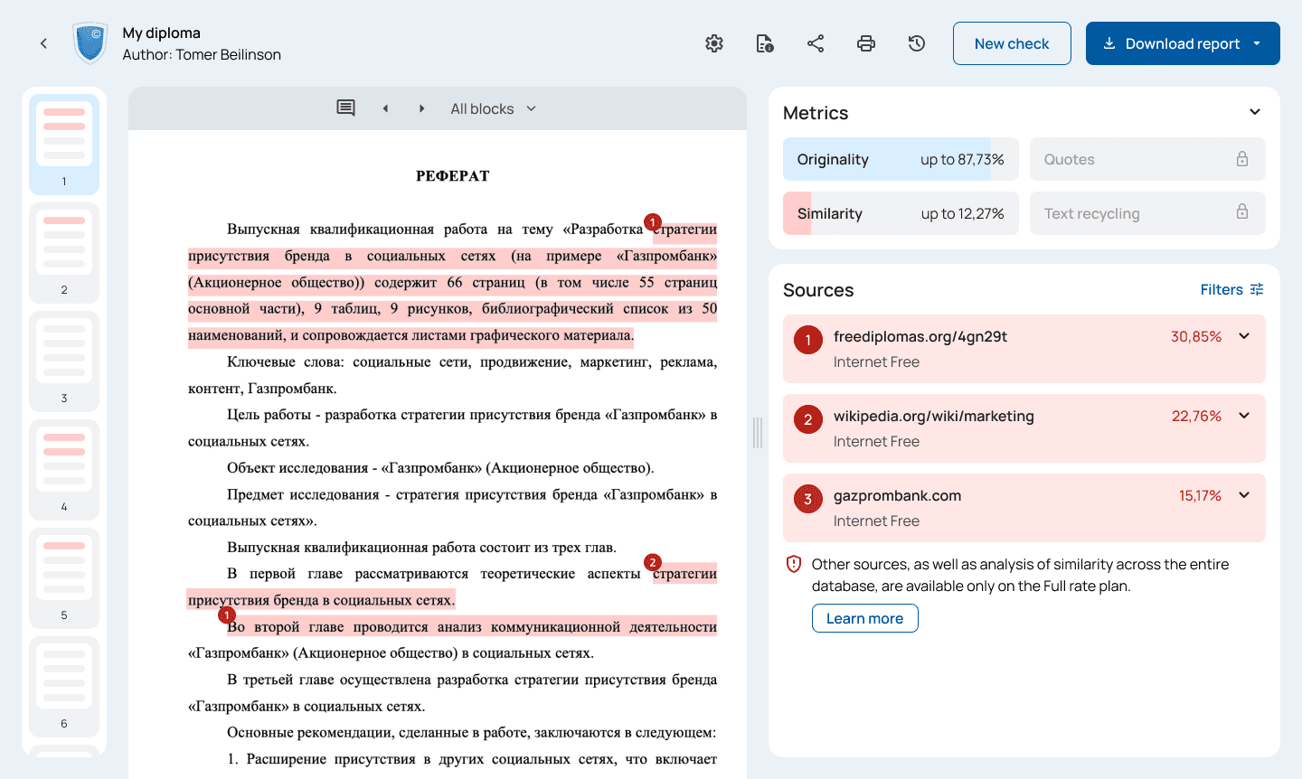
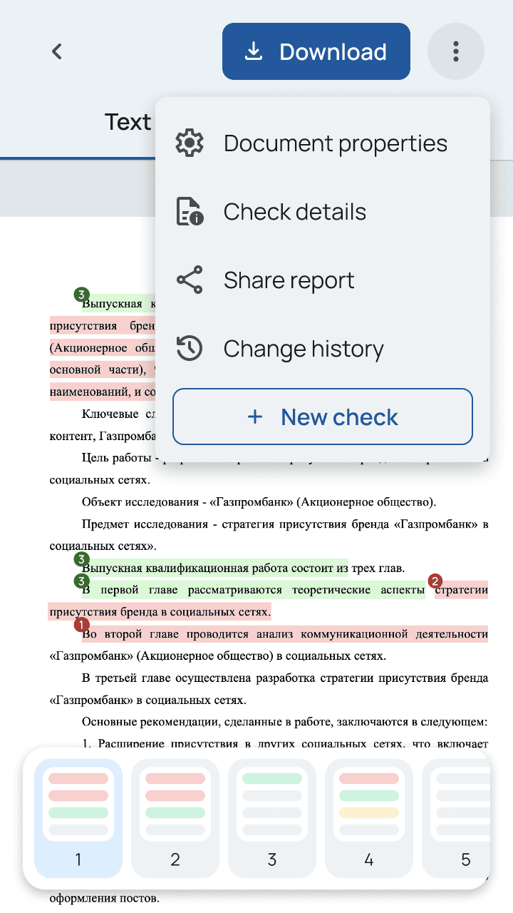
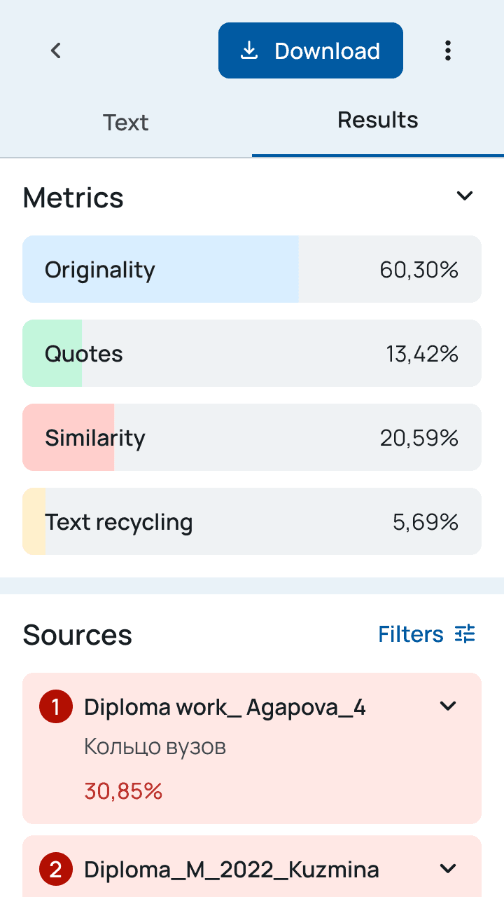
1.3 Check results
Research
Why the redesign was needed
How it all started
While working as a content marketing manager at Antiplagiat, I observed several usability issues, including pogo-sticking and ambiguous rate plan distinctions.
These observations, coupled with analysis of prior user research data, highlighted a need for further investigation.
In collaboration with a product manager, we pinpointed a set of critical problems requiring focus:
Unintuitive Paths. The website's navigation and user flows are confusing and disorienting.
Locked Free Checks. Free checks become unavailable when paid checks are on a balance.
Misleading Results. Free check results present incomplete or inaccurate information about limitations of the Free rate plan.
Diving into the details
After initial research, I decided to conduct an expert review and usability study with 5 people who used the service in summer 2023. It helped to surface notable usability issues.

2.1 Homepage
Location reference
1
Confusing navigation. Clicking on the logo or “Home” in breadcrumbs leads to the tariff comparison page.
2
Inaccurate labeling. Some people hesitate between “Document” and “Text” because there is text inside the doc.
3
Pogo-sticking. Click on the name of a document leads to its reading version when the users expect check results.
4
Poor information architecture. Folders are rarely used feature. The double footer is also redundant.

2.2 Check results
Location reference
5
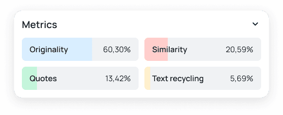
Misleading results. On the Free check, originality is up to X% and similarity is from Y%.
6
Lack of clarity. The user doesn’t know the difference between buttons until they are clicked.
7
Cognitive overload. Visual prominence of secondary functions distracts the user from the main flow.
2.3 Check results
Location reference
8
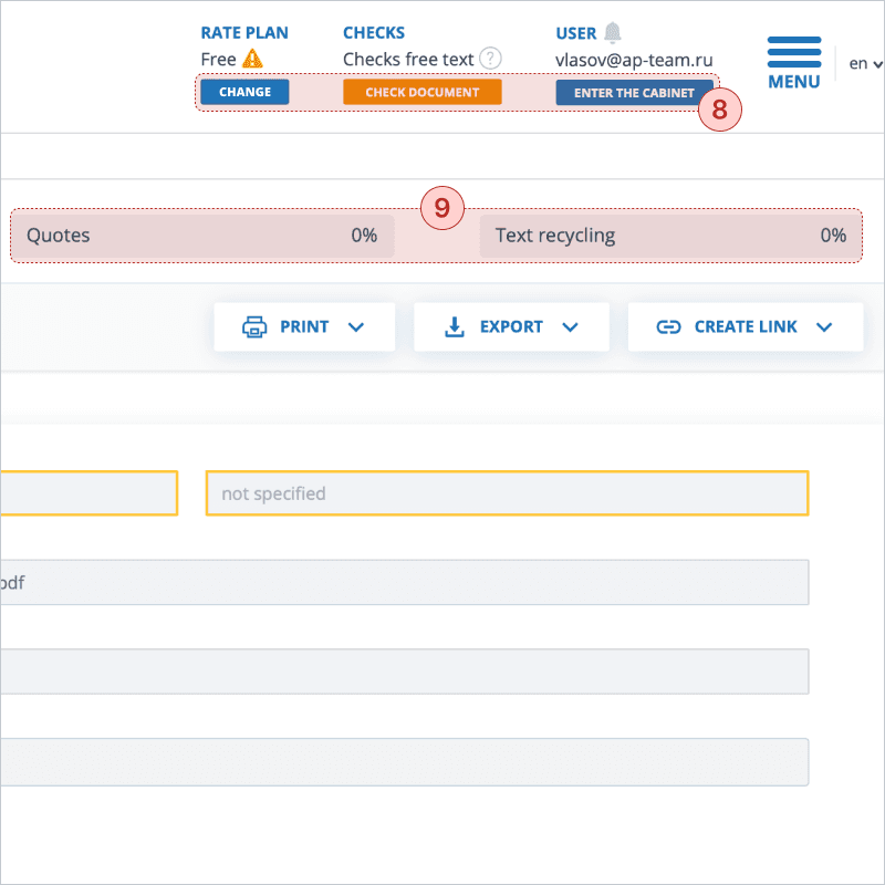
Accessibility concerns. Some buttons are too small and the color contrast on orange buttons doesn’t meet WCAG guidelines.
9
Hidden limitations. On the Free check quotes and text recycling aren’t analyzed but they are shown as 0%.
Understanding competitors
I explored the following products to understand their user flows, strengths, and weaknesses: eTXT, RusTXT, Scribbr, Copyleaks, Chegg, Unicheck, and Grammarly. Key findings included:
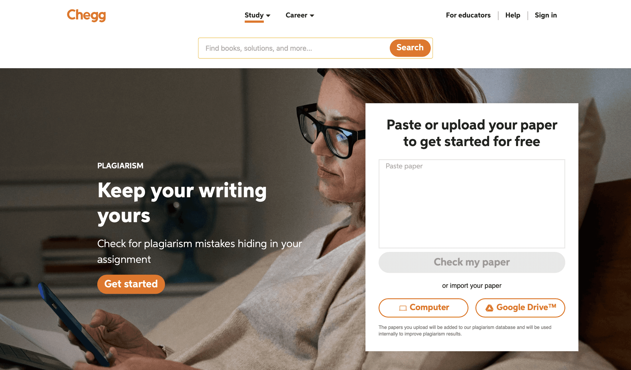
2.4 Chegg (homepage)
Most of them have a window to paste text or upload file right on the landing page or on the dashboard (like Chegg in image 2.4)
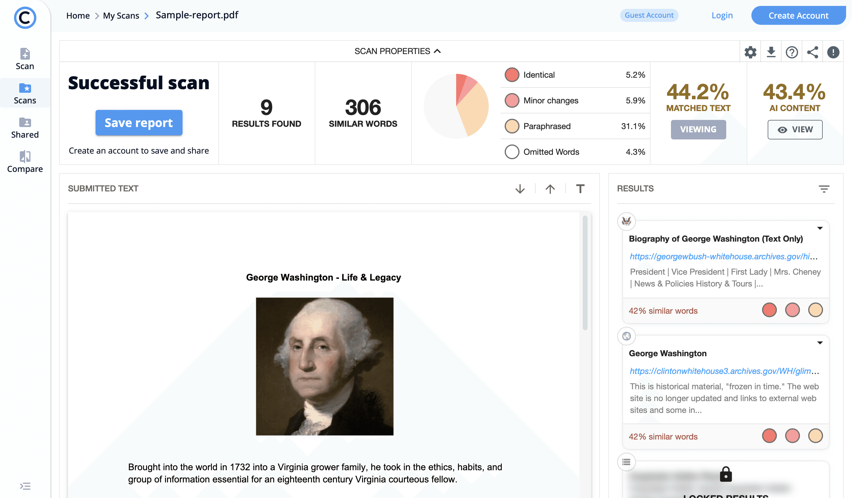
2.5 Copyleaks (sample report)
Some of them have a sample report to demonstrate the benefits of paid checks (like Copyleaks in image 2.5)
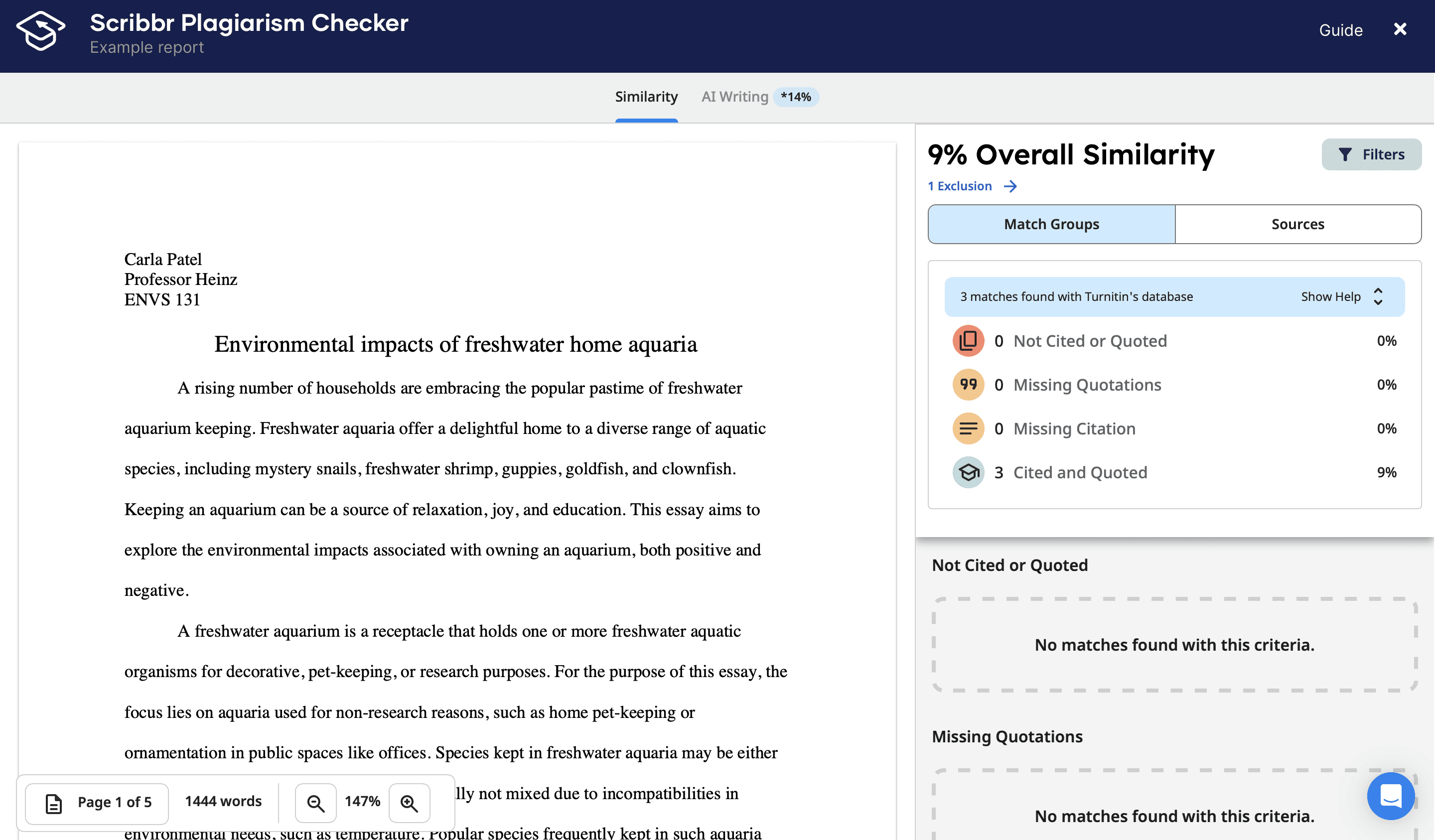
2.6 Scribbr (check report)
All of them have one combined page for check results with metrics and sources (like Scribbr in image 2.6)
THE CHALLENGE
Flow update
Time for change
Pinpointing the issues
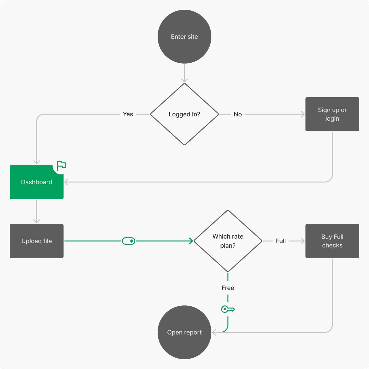
Here is the current user flow of file checking that the user is expected to follow.
Please note that for the case study, the diagrams were simplified. For example, the user skips buying Full checks if there are any on a balance.
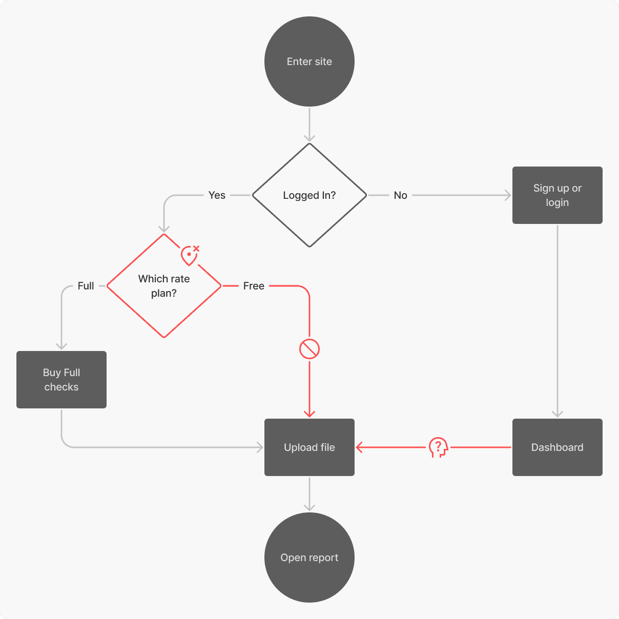
3.1 Existing user flow

If the user is logged in, they land on the tariff comparison page. When the user logs in or signs up, the landing page is different and it is the dashboard.

It’s impossible to choose the Free rate plan if there are Full checks on a balance.

If the user logs in or signs up, the step of choosing a rate plan is skipped and the user checks a file/text on the Free rate plan by default.
Let's fix it
I tackled these issues with small but fundamental changes.
3.2 New user flow

Any user lands on the dashboard anyway: logged, signed up, or just logged in.

The user can’t skip the important step of comparing and choosing rate plans.

The Free checks are always available even if there are Full checks on a balance.
Dashboard layout
To make the interface more scannable, the standard dashboard layout was chosen. On the homepage the main focal point was on file uploading — the most popular action.
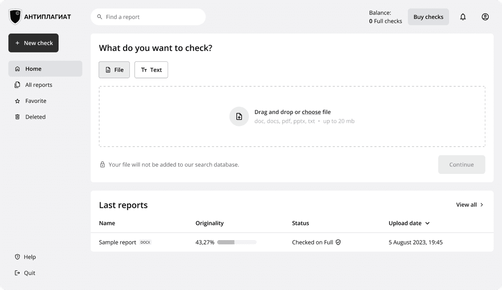
3.3 Homepage wireframe
Conditional wizard
After uploading a file, the modal wizard opens. It consists of all the important steps to get a file or text checked and prevents the user from wandering off.
Also, it has conditional logic. If the user chooses the free rate plan or if the user has full checks on a balance, buying checks will be skipped.
3.4 Lo-fi prototype of the modal wizard
Combine them all
Instead of several pages of check results, one combined page was created.
The report layout is similar to the existing one but now the user doesn’t have to make an effort to find sources and original text. All secondary functions were hidden under icon buttons on the top bar.
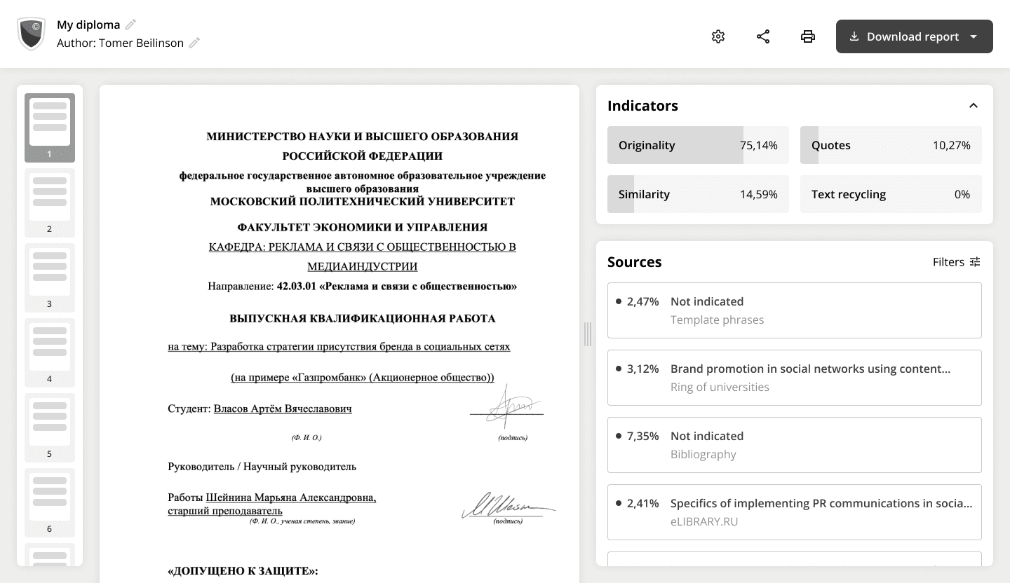
3.5 Wireframe of the check report
About responsiveness
Since the service is used on desktops almost exclusively, I decided to make a mobile version at a later stage.
Usability study
Test on real users
Parameters
As soon as the work lo-fi prototype was ready, I rushed to do its moderated usability study.
There were the same 5 people who I interviewed in the usability study of the existing interface.


Key findings
Navigation. All 5 participants mentioned that navigation is much better now, but 4 of them struggled to go back from the report to the homepage.
Confirmations. Participants praised the new user flow, but 3 of them were surprised by the absence of payment confirmation and a clue about where their report was.
New check. There was no new check feature on the Full report page. On the Free report page, this feature should allow users to check any file, not an open one.
All of these were addressed in the final designs.
Visual design
Style Guide
Inspired by Material 3
The basis was created upon Google Material Design but with some modifications for web usability and brand identity.
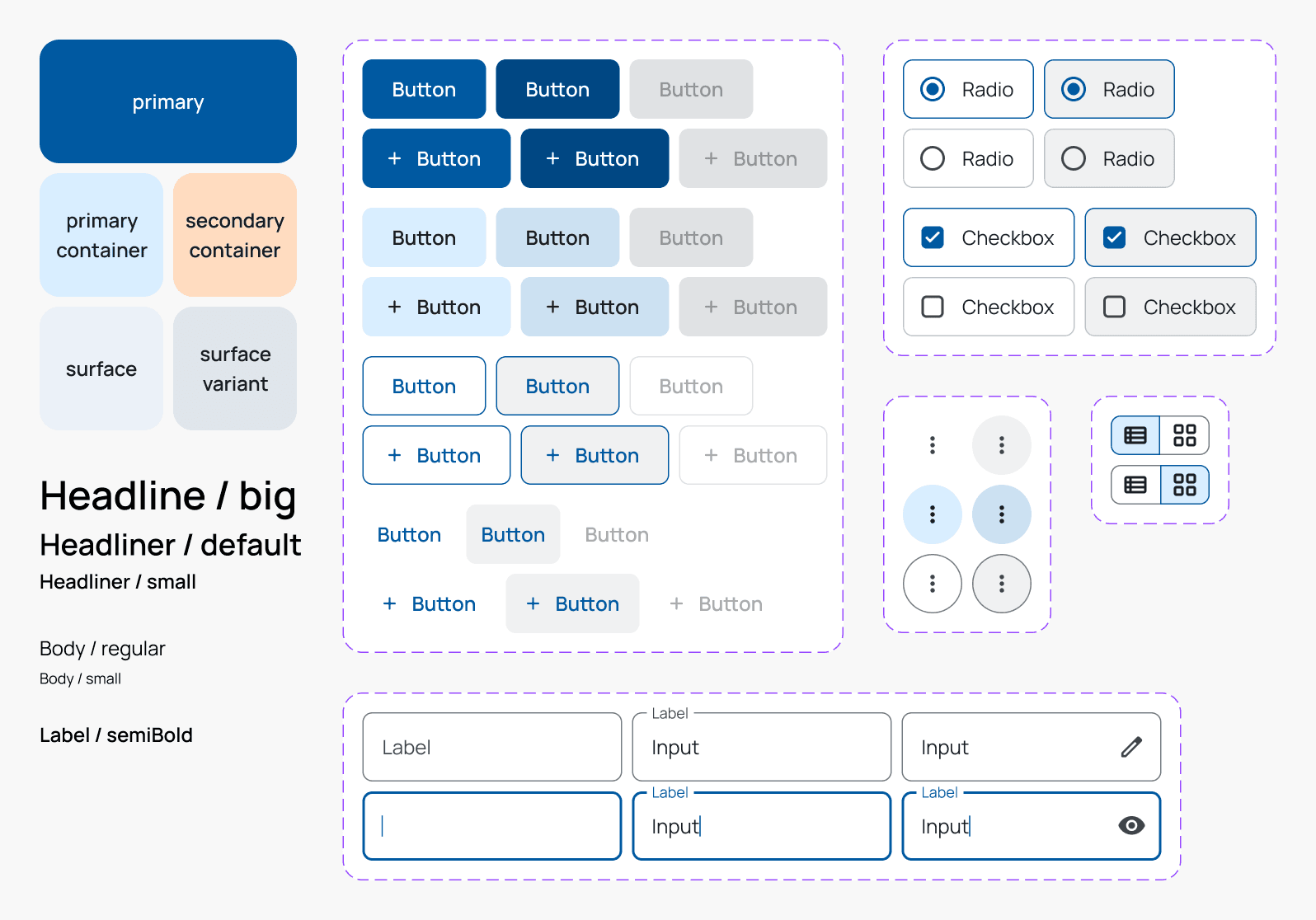
5.1 Basic components
And custom components
Service specifics required to make a bunch of custom components such as states of uploading a file, check metrics, tables (with list and grid views), and others.

5.2 Uploading file

5.3 Custom components
Final designs
Effortless checks
Desktop
6.1 Homepage
6.2 Modal wizard
6.3 Popover

6.4 Grid view of all reports
6.5 Full check report
6.6 Handlebar
6.7 Free check report
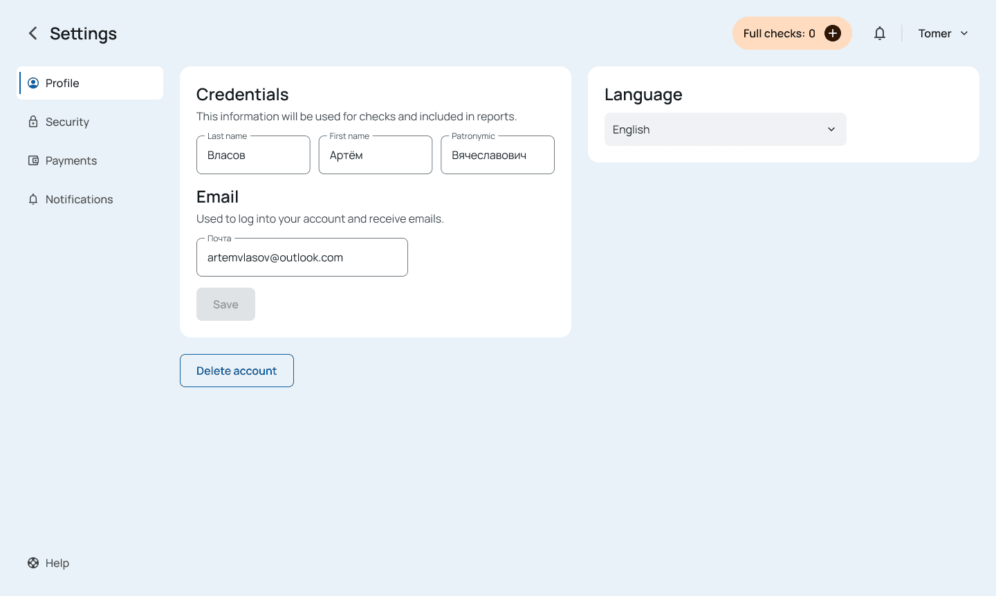
6.8 Account settings

6.9 Login page
Mobile
In the mobile version, a 1-column layout was used. Due to its limitations, a few functions related to viewing text and sources simultaneously became unavailable.


takeaways
Looking back, moving forward
Impact
Redesigning the interface skyrocketed the System Usability Scale from 55 to 90, a 64% improvement, marking a significant leap in user experience.
One of the usability study participants shared:
«The new interface is simpler and more convenient than the previous one. I really like that all the buttons imply what is behind them»
Key learnings
The importance of user research. Conducting thorough user research (expert review, desk research, content audit, usability testing) helped identify key pain points and inform the design direction.
Prioritizing user needs. Focusing on the most popular features and streamlining the user flow led to a more intuitive experience.
Next steps
1
Present the case study and its learnings to internal stakeholders to advocate for redesign or, at least, incremental improvements in areas where it is possible.
2
Conduct A/B testing to compare the performance of the redesign with the old one.
3
Explore adding features based on collateral user needs relating to academic papers, such as the need to write in an academic style or correct formatting of quotes.